PANTONE 2018
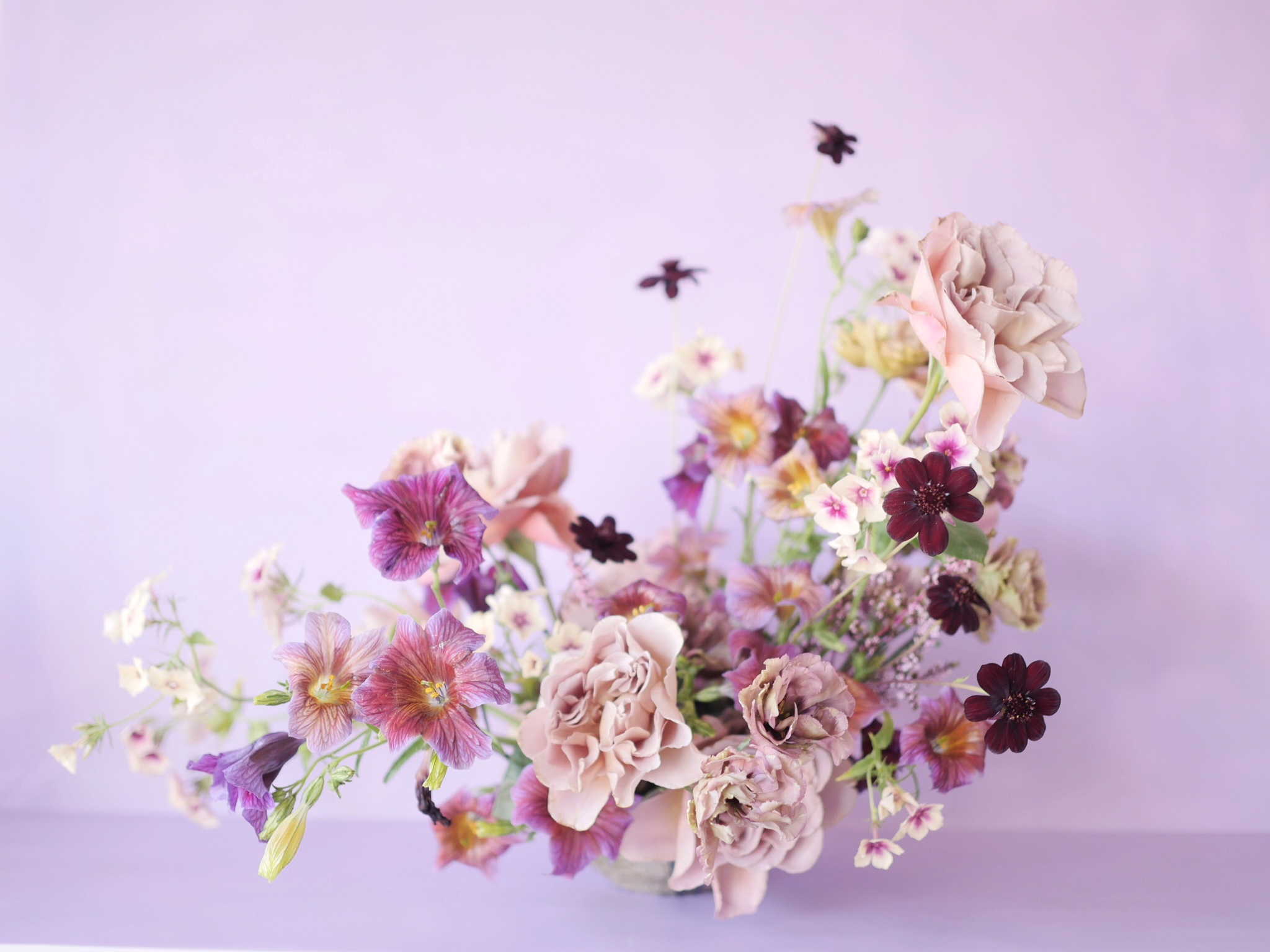
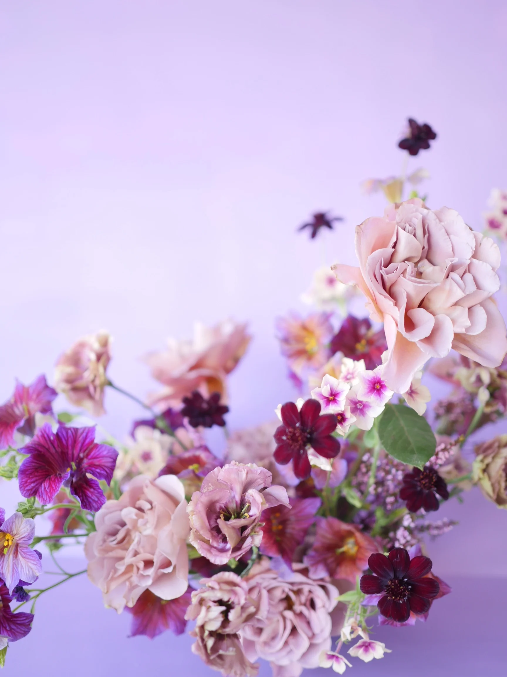
I have never been a huge fan of anything in the royal purple family, so when Pantone released their color of the year as "Ultra Violet" I was not impressed or inspired at first. As the year went on and I had the chance to design and style a few photoshoots, I realized I could get on board with pretty much any color if styled properly and paired with subtle analogous colors or if the color was exaggerated through monochromatic design. With this in mind, I set out to the Portland Flower Market to look for some product to create a floral arrangement in this "ultra violet" tone that was deemed fantastic by Pantone.
One thing to keep in mind when designing a piece that is almost monochromatic is that colors don't ACTUALLY have to be monochromatic. They just all have to be close, or analogous, meaning they are touching on the color wheel. In this case I went purple, but allowed some burgundy and magenta in there. When paired with a backdrop that is the main color you are trying to design with, flowers tend to pick up that color and the overall result looks very monochromatic, but has more interest for the eye than if the flowers were all one exact same color.